I looked at the NYT and completely missed the chart of the year ...
My brother Richard from Connecticut sent me the URL to this article and chart from the New York Times not once, but three times! When I looked at it the first time, I simply stared in disbelief. Yeh, I should have seen it coming ... I even heard Randi Rhodes chirping about it both in my sleep and after waking earlier in the week. Still, the fact that it was a slide from a classified briefing being given at the time by the United States Central Command (called "Cent-Com" ... and within a few miles from where my wife in Florida lives, although with a forward command center in Qatar) made it more real than real.
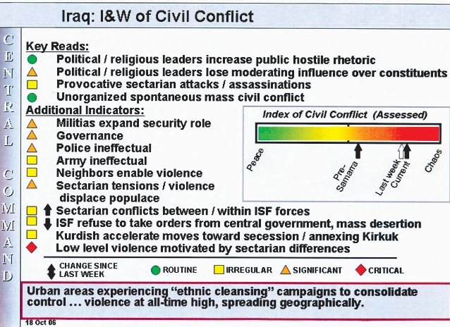
If you squint and look very, very carefully at the chart, the date that the briefing was given is in the very bottom-most left. October 18 was only two weeks ago and the direction and rapidity that the up-arrow below the rainbow colors is moving suggest that we are nearly at total chaos in our occupation/conflict in Iraq.
Like everything in the military these days, even conflict is "indexed" with color codes and weird little markers of odd shapes ... and references made to previous briefings that make the impact really shocking only if you have been watching the "briefing" every week for several months or more. The black arrow under the orange area on the "rainbow bar" shows that the bargraph of sorts is divided into pre- and post-Samarra regions if the arrow tends to move regularly to the right... and it does! "Samarra" refers, of course, to the attack in February of this year against the Shiite mosque in Samarra.
As most of you know, I am opposed to leaked classified information (presumably, this briefing was SECRET, but the chart is not marked with any specific classification ... probably UNCLASSIFIED in and of itself) being printed in our daily newspapers, but the import of this chart is devastating. As you all are probably aware, such charts are based upon both factual numeric data (KIA, wounded, civilian deaths, etc.) and subjective indicators such as a measure of how vitriolic the "sermons" at the Friday mosque services have been.
Admittedly, if you look at the colors in the small shaped codes on the left, you will see that other factors (than pure out-and-out chaos) aren't doing so poorly. The political/religious leaders aren't promoting the violence (green circles), for example, although their effectiveness in holding the violence down is "orange" and ... well you can read the chart as well as I can.
The bottom line of all of this -- the colors, shapes and legend -- is that the bright red just above the up-arrow for "current" (18 October) is about as bright red as the far right-hand end of the colored bar.
No matter how many times we hear "victory" or "splendid" or "swimmingly" or "improving" or ... we are sliding into total chaos.
I only wish I were lecturing particle physics wherein chaos is both expected and exhilarating ... and not posting information that the New York Times portrays as both SECRET and current vis-a-vis the carnage in Iraq. That red you see on the right-hand end of the bar is blood!
It's the blood of our sons and daughters ... and husbands and wives ... the blood of America!
posted by Dr. Joe @ 8:51 PM
0 comments
![]()
![]()


0 Comments:
Post a Comment
<< Home